Introduction
Our assignment for Term 1 of Type West was to create a digital revival of a historical metal typeface, based on a single printed source. During the first week I visited Adobe Books in the Mission District and looked through the science section for anything that looked old. I found a book called “Mathematics and the Imagination,” published by Simon and Schuster between 1940 and 1958. I was immediately drawn to it because it looked like something I would like to read. The book is around 400 pages and has plenty of figures and math symbols, as well as italics and small caps.


The book introduces problems from many different branches of math with the goal of making them seem more approachable. Throughout the book, the authors emphasize the creativity involved in mathematics. Since I have an interest in math as a hobby, I thought this would provide a good theme to base my presentation on. The authors describe their approach to writing about math as “haute vulgarisation,” a French term meaning “that happy result which neither offends by its condescension nor leaves obscure in a mass of technical verbiage,” and I came to think of my revival project in a similar way. The concept of simplistic beauty and elegance is often brought up in regards to mathematics, and this is something that Baskerville embodies as well. I think it was as good choice of typeface for this book, and the rough paper it was printed on makes it look more approachable compared to more high-quality specimens and digital fonts. The typeface I ended up designing was a friendlier version of Baskerville, while keeping the sense of geometric balance.
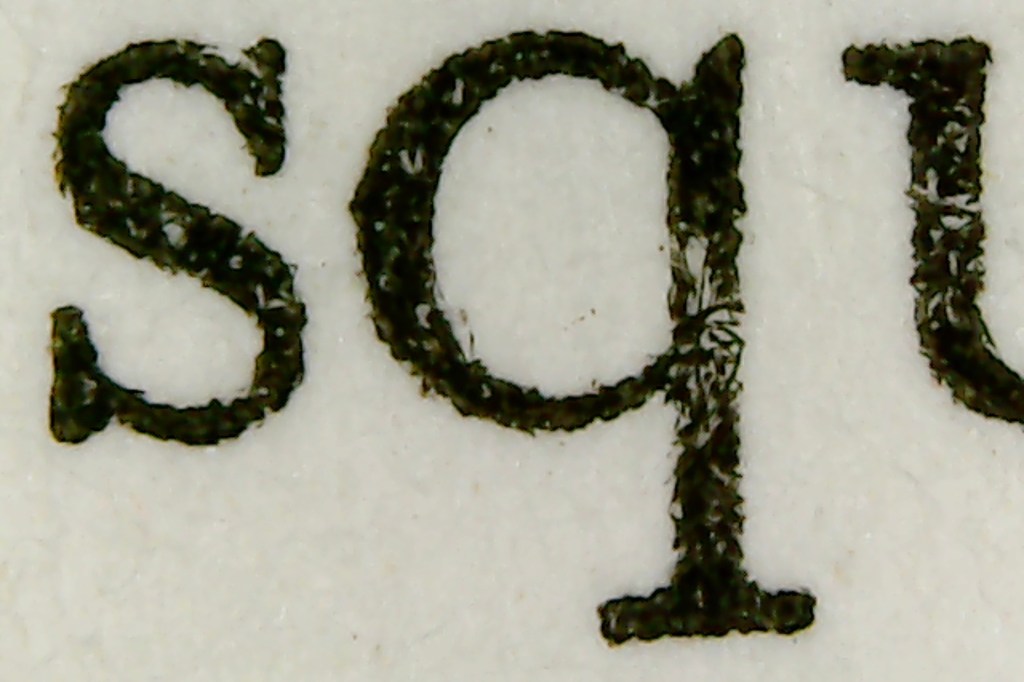
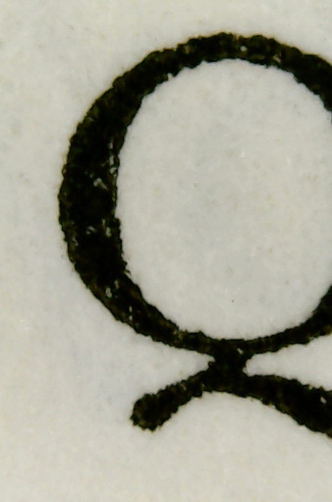
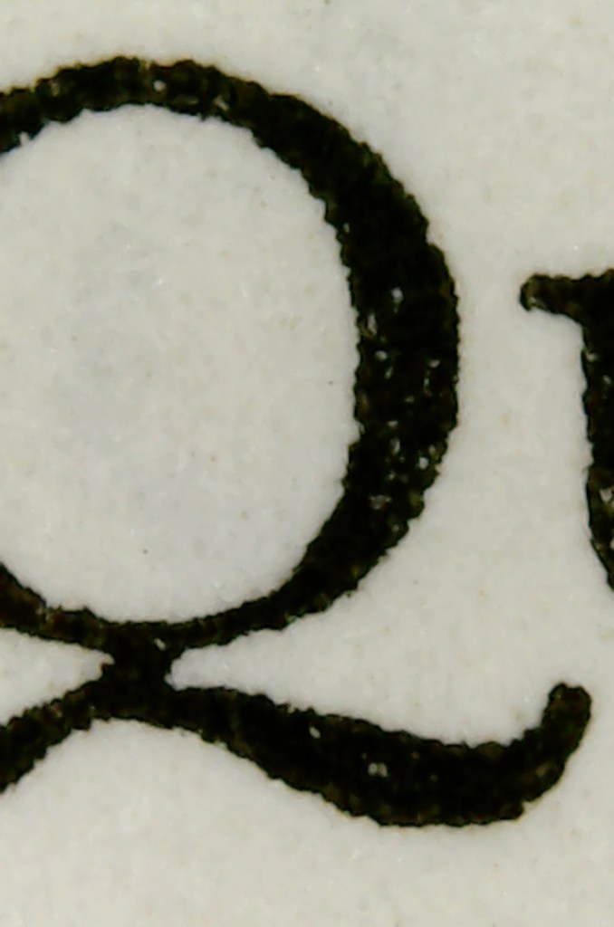
In class I inspected my source material to figure out what typeface it was set in. I noticed the ball terminals, the slope of the bowl on the lowercase a, and the symmetry of the curves. I compared it to popular serif typefaces, ruling out old styles and the ones that looked too narrow. The deciding factor was the capital Q, which has a distinct multidirectional tail that I really like.
History of Baskerville
John Baskerville was born in 1706 in Worcestershire, England. Before starting his printing business, Baskerville worked as a calligraphy teacher and then as a gravestone carver in Birmingham. He then got into laquering furniture and home goods, where he made enough money to start his printing business.
Baskerville was a perfectionist, and spent a decade preparing for his first publication. His goal was to showcase his new techniques and printing technology. His experience working with laquer inspired him to develop a new kind of ink that was said to be thicker than other inks and would not spread out on the paper. He also developed a method of pressing the paper between hot plates after it was printed to create a smooth and glossy finish. These new techniques resulted in unusually crisp and thin letterforms, which were controversial at the time but later became sought after.

Existing Revivals
Baskerville
Monotype
Mrs Eaves
Zuzana Licko / Emigre
Libre Baskerville
Pablo Impallari
Baskervvile
ANRT
Source Images & Analysis
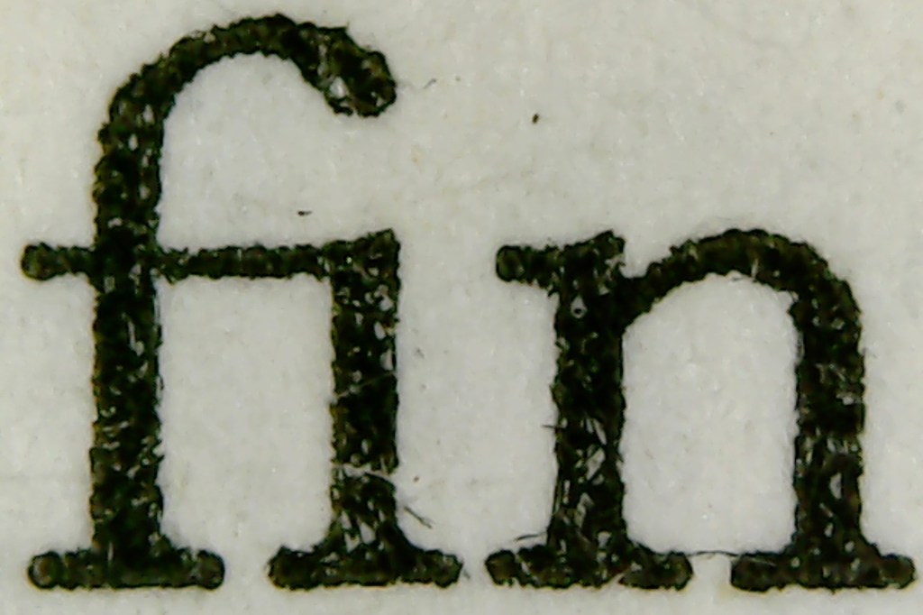
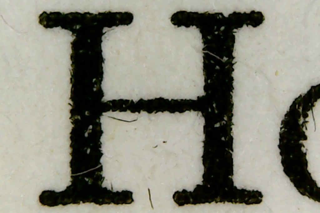
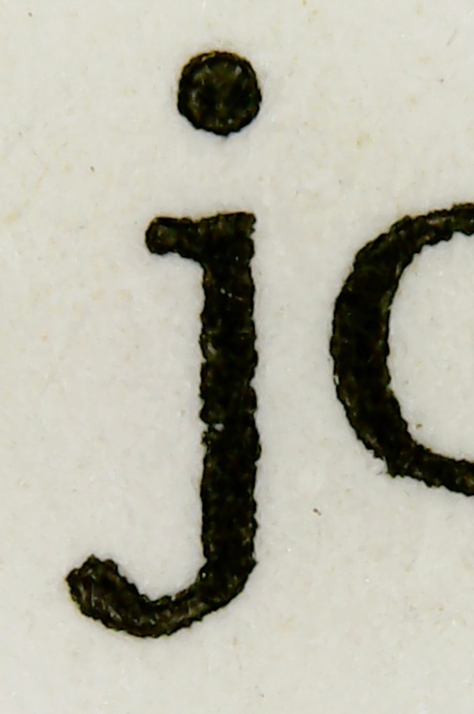
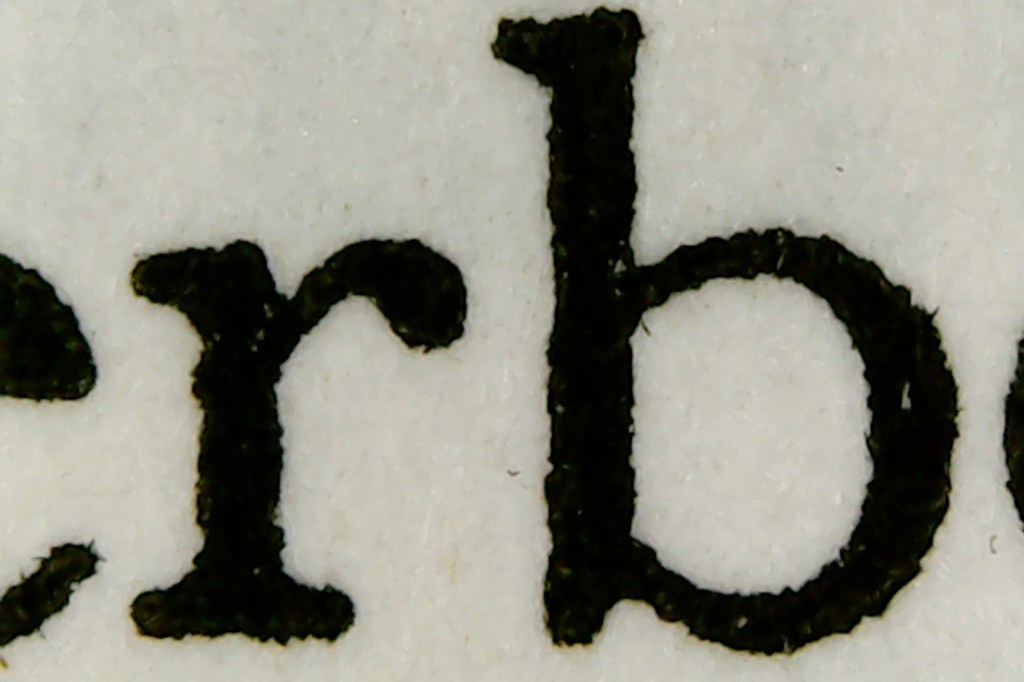
My 1200dpi scans weren’t detailed enough to draw outlines from, so I needed a method of taking close up shots of the text. This would allow me to easily analyze the print quality and notice subtle differences between different instances of the same character. I tried using a magnifier with a built-in LED, but decided against it because it distorted the image too much, and it was difficult to position a camera above it for consistent results.
I ended up using a digital microscope that connects to my laptop. I like it because it created more consistent lighting than a regular camera. One issue with this method was that the digital microscope only captures a very small area that’s just large enough to fit the cap height, but not the capital Q or J.


For the capital Q, I took multiple overlapping photos and then stitched them together in photoshop.

I also used this method to create a close-up image of the word ‘Hyperbola’ with accurate spacing.


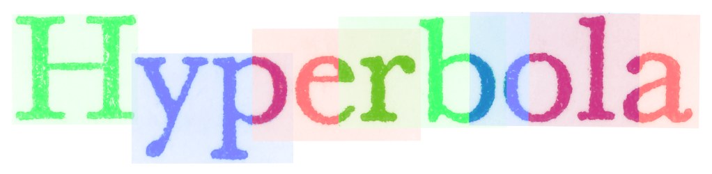
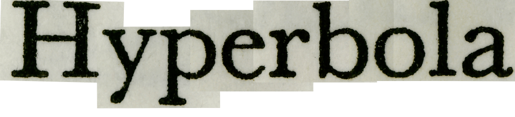
I used this composite image as a reference for my initial sketches.

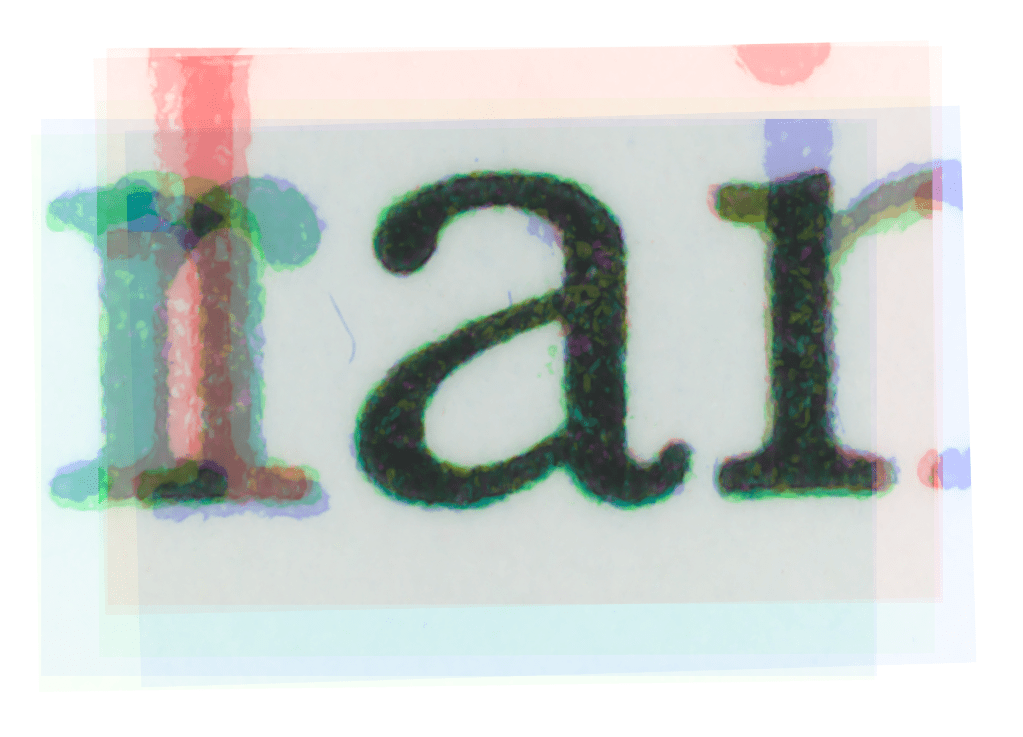
Looking at microscope images, I noticed that the paper was extremely rough and the pressure was inconsistent, causing ink splotches and uneven weight. This made it unclear how the original metal type was intended to look, which features were intended by the designer and what was a result of cheaper printing.

In an attempt to find some consistency, I created composite images by overlaying different instances of the same character. For each character I collected microscope photos from six different pages, avoiding the ones with too much pressure. In Photoshop, I applied different colored gradient maps to each layer and set the blending mode so the common areas end up black and the ink splotches are different colors. This created a fuzzy colorful edge, which I then removed by applying a black and white adjustment layer and bringing all the colors up to white.
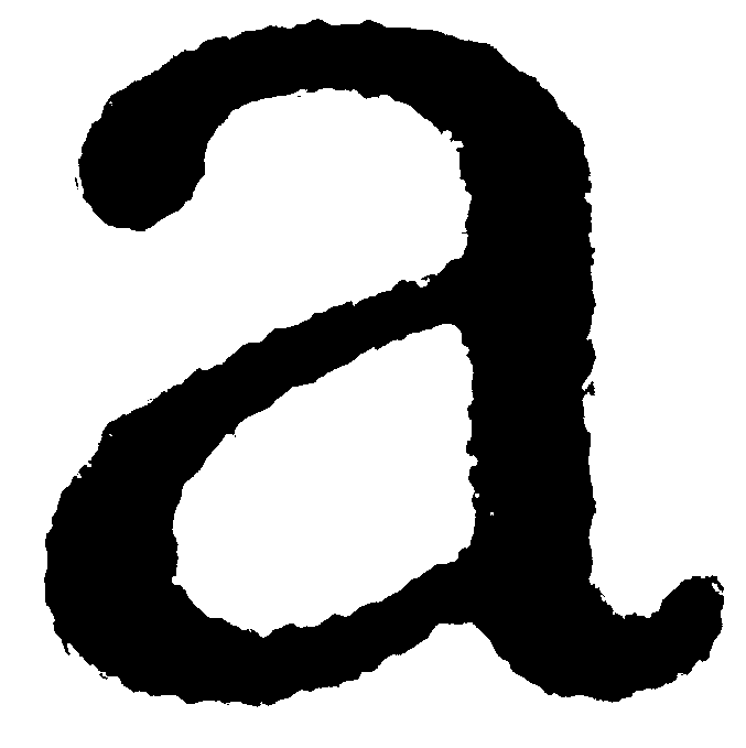
I used these as a starting point for tracing most of the lowercase letters, and a few of the capitals. It was helpful in determining the weight and contrast of my drawings, but some of the finer details like the bracketing on the serifs was still unclear.
Design Process
Because I was designing a text font, I had to lower the contrast compared to the original and most revivals. I was going for a weight that was similar to Mrs Eaves, which was close to my source material. The text in Mathematics and the Imagination looks significantly darker than the original Baskerville and the Monotype specimens, probably due to the rough paper it was printed on. My goal with the digitization process was to reduce the blobbiness and inconsistency in my printed source material, while preserving the weight and lower contrast that happened as a result of the printing process.

Figures
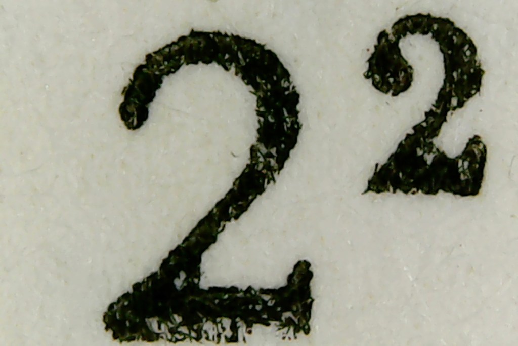
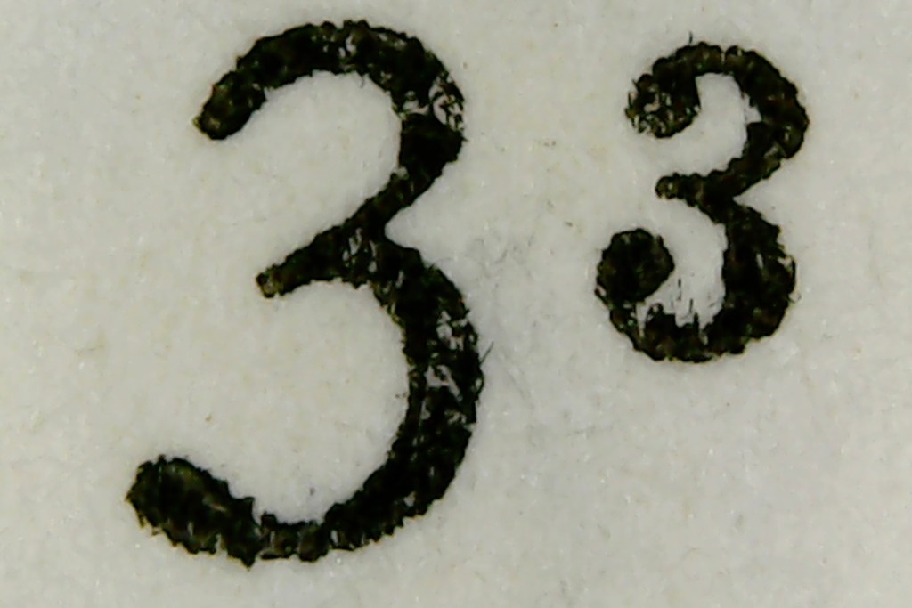
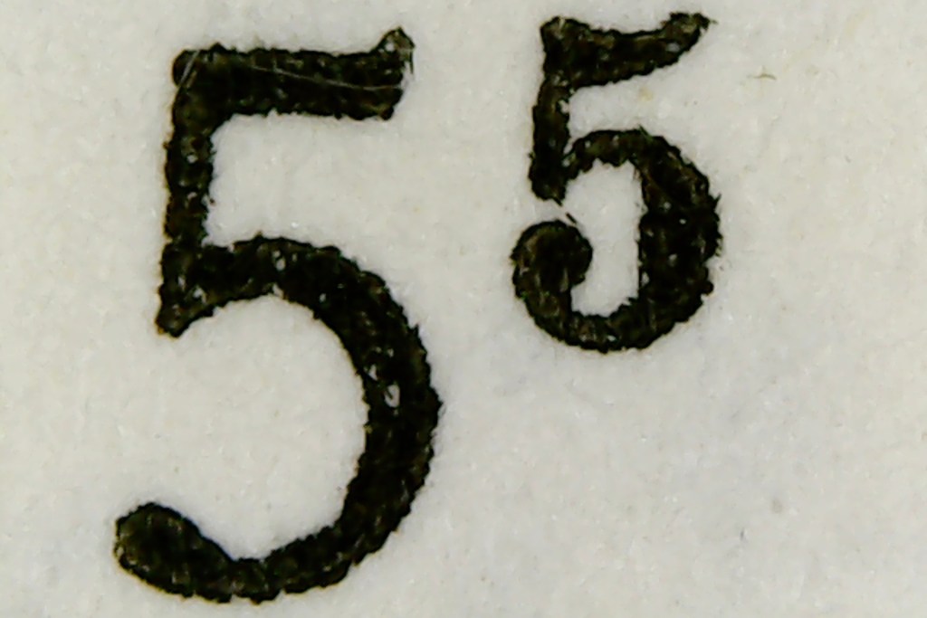
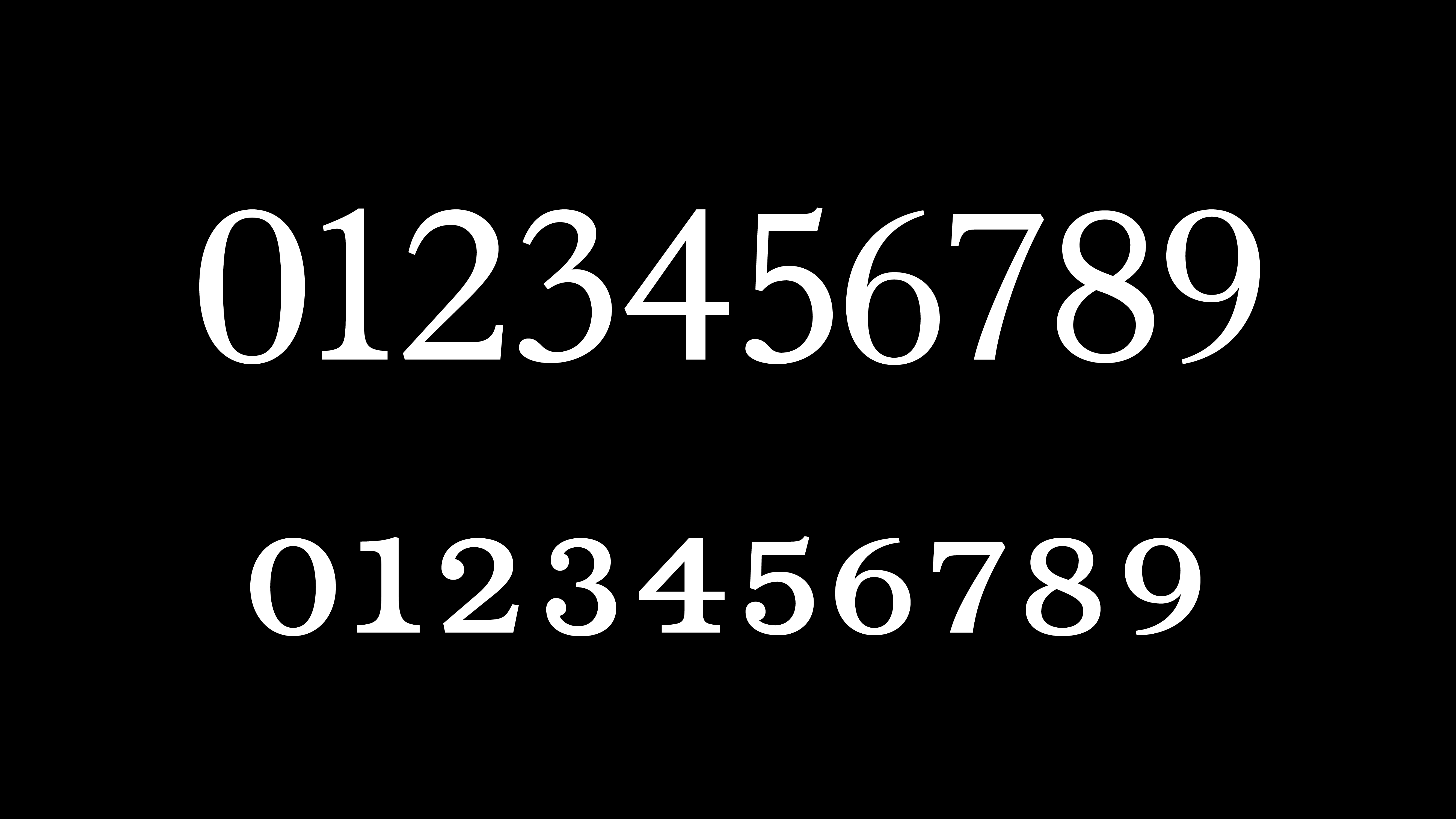
I noticed the lining figures don’t look like the Baskerville figures from the Monotype specimens or any of the Baskervilles I had seen. The ‘2’ and ‘3’ don’t have the curly terminals at the top, and the ‘5,’ ‘6,’ and ‘9’ don’t have ball terminals and aren’t connected in the middle.

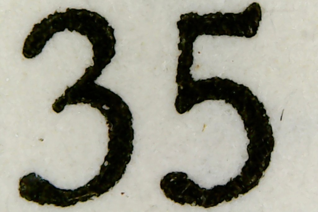
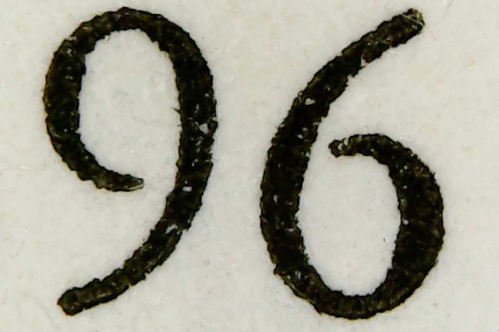
There are also two additional sets of figures in my source. Lining figures are used for numbers in the text, small caps are used for exponents, inline fractions, and fractions within fractions, and oldstyle figures are used for page numbers.
During the break I began designing my specimen and another sample publication, and I realized the lining figures I had drawn based on my source weren’t working with the rest of the typeface. I decided to redesign them, referencing Monotype’s digital version of Baskerville, Pablo Impallari’s Libre Baskerville, Zuzana Licko’s Mrs Eaves, and František Štorm’s Baskerville Neo.
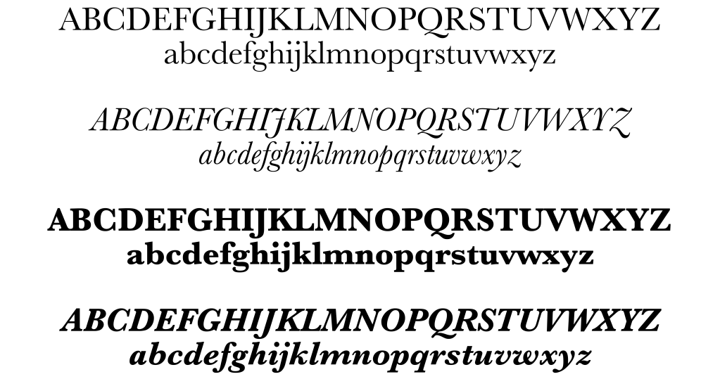
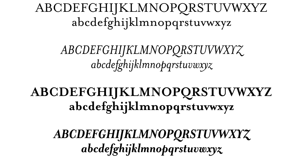
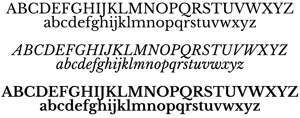
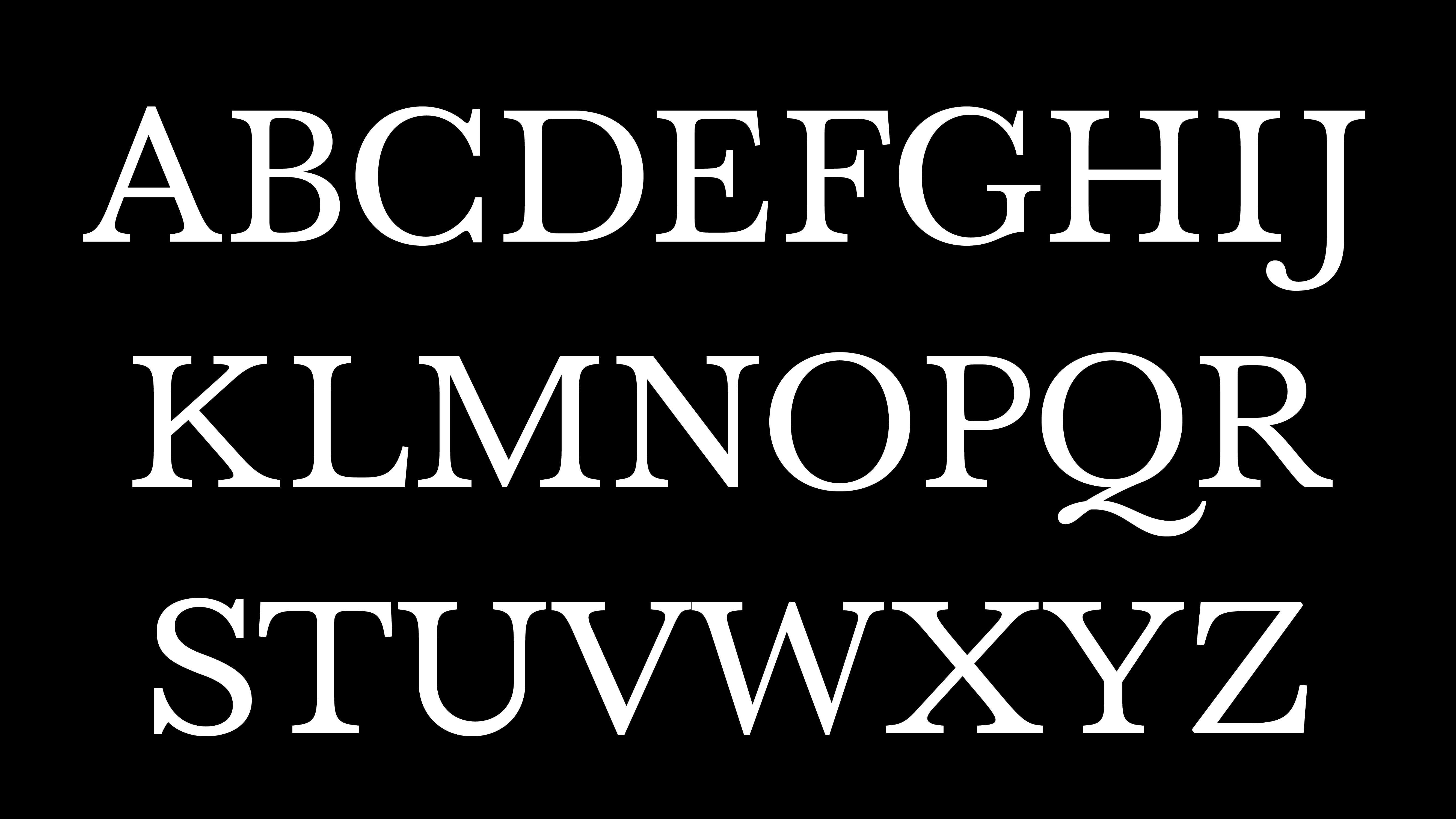
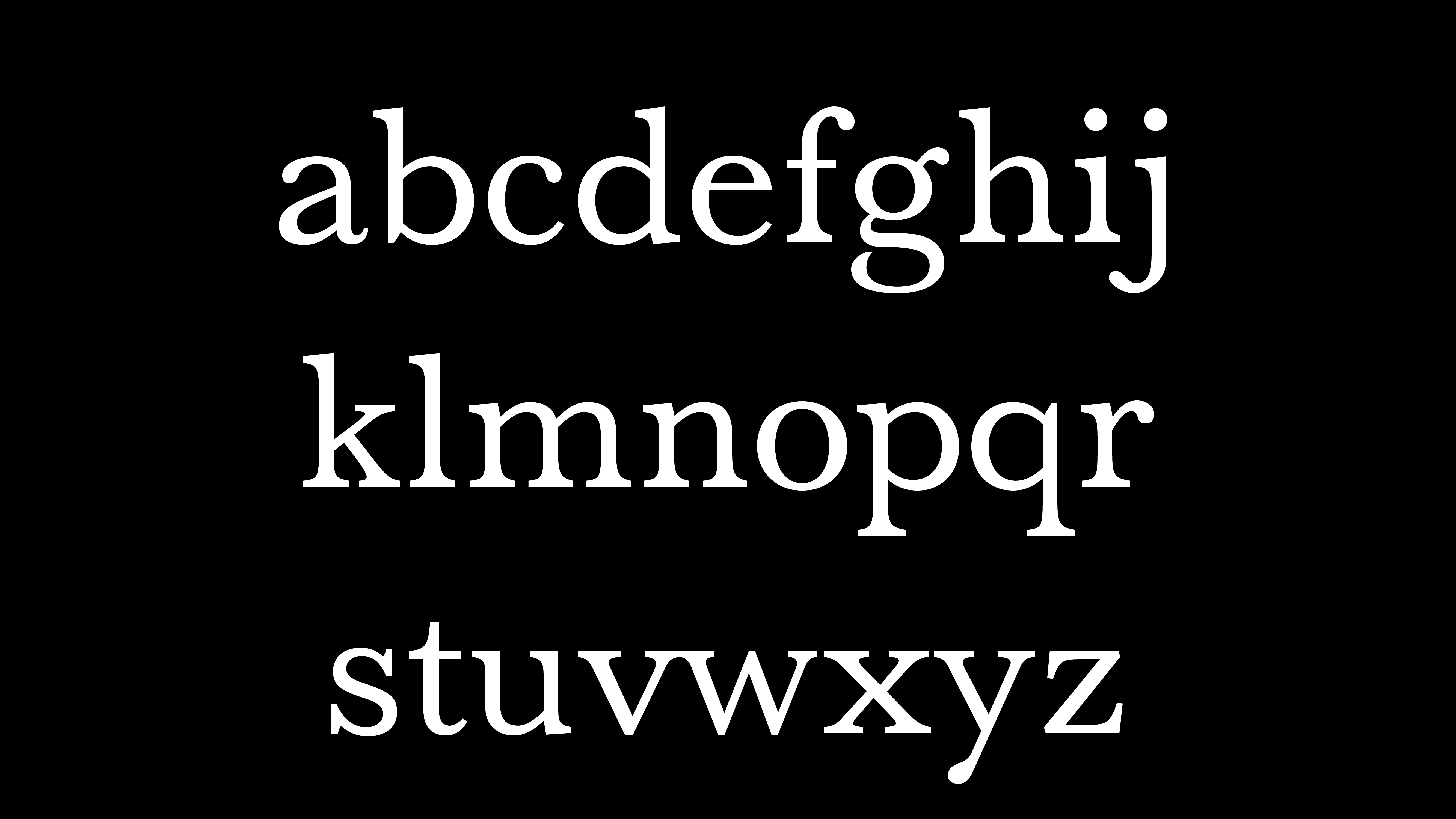
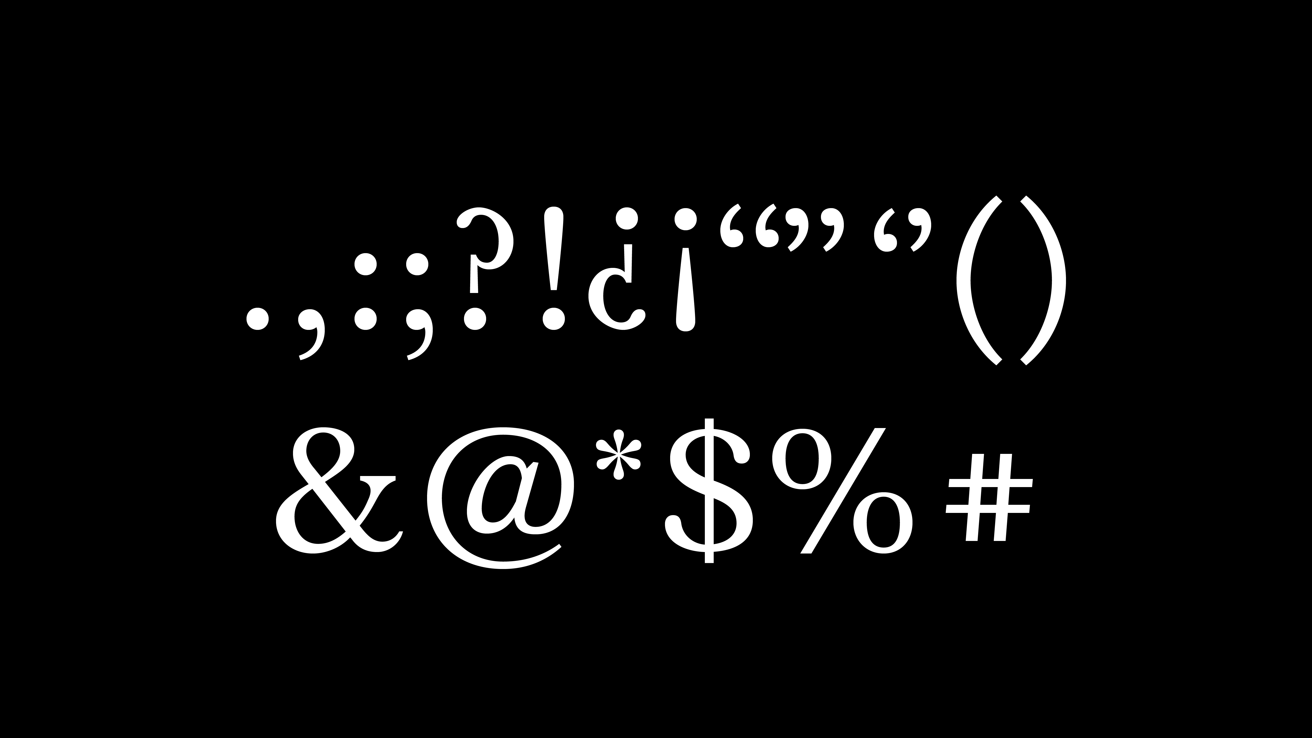
Final Result
uppercase
lowercase
figures
punctuation & symbols
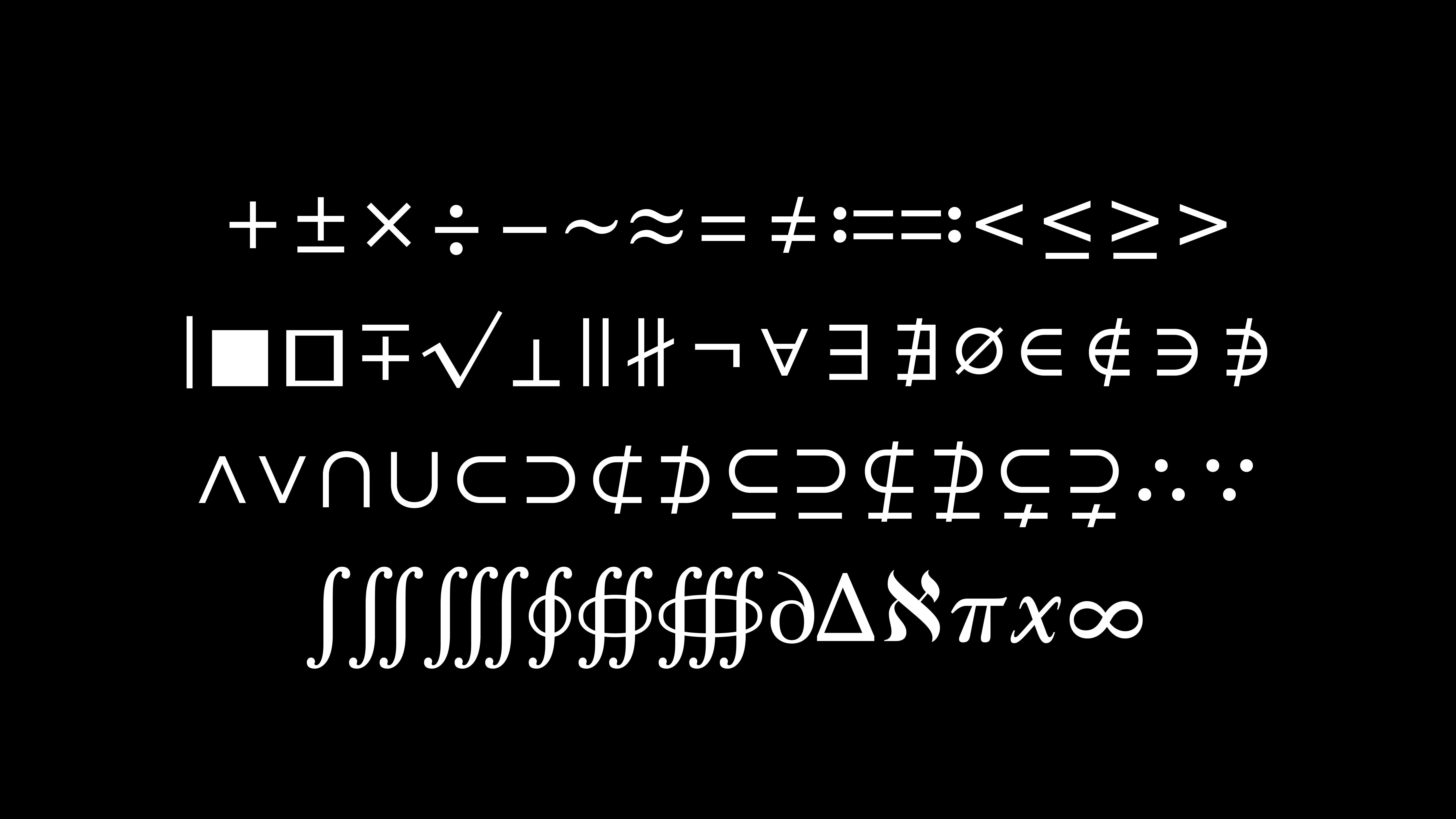
math symbols