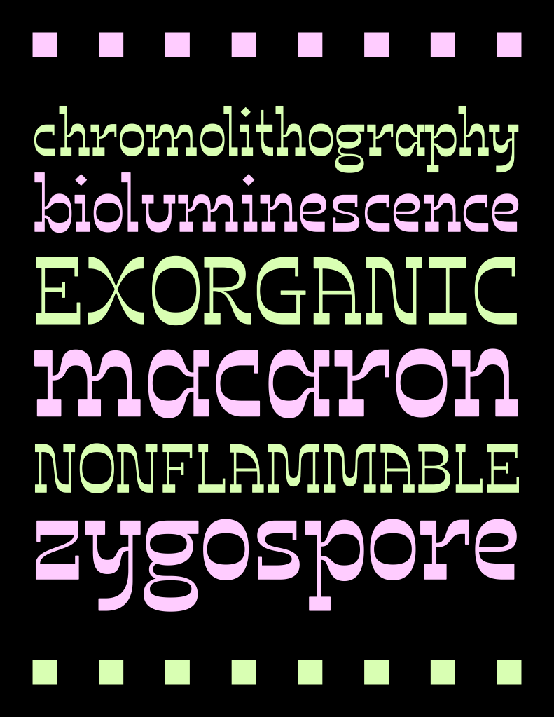
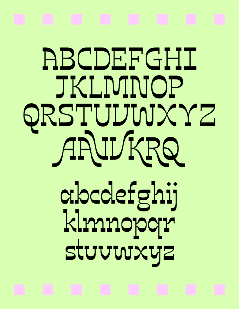
In my redesign of Quirk 1 from 2019, I wanted to incorporate more of the wavy lines I had been drawing, and this is what inspired the W, M, and N. I also redrew the tail of the Q, and then updated the K, R, and X to match. Deciding how to do a reverse contrast b/d/p/q and r/n/h that matched the vibe I was going for was the most difficult part, and I went through several different ideas before deciding on the final shape. I used Karen Cheng’s Designing Type as a guide when refining the letterforms.